Now that i have my card size finalised, i can think about the envelope construction. It's important that i have a strong looking envelope to really polish off my card.
Here are some possible ideas that are already out there:


Introducing the air-mail theme is nice because there is so much more going on on the envelope than if it were just a regular one, however, this does and at the same time does not relate to my card. There is always the potential that it may end up over seas, and i suppose it does fit nicely with the postcard theme, however, it is just a greetings card.

I have chosen to focus on this envelop because of the stamp involved. I like it's aged effect and authenticity that it gives off. Perhaps something i can include onto my envelope to stop it being so plane at the moment... Instead of this rounded stamp, i could always use the Chimney 'logo' that i have used on the rear of my cards.

Coloured envelopes! This will definitely stop any planeness, and i could potentially relate it to my warm card range with an off white or bright colour. Perhaps a pattern?...

Patterned envelopes! Definitely a way of making my card stand out, However, i think now that with the time i have left i doesn't seem worth doing what would only be a half hearted, rushed job. Perhaps i will consider this route if i ever come to hand make my cards myself.


I have come across this lined envelope that appears to not be just the basic triangle fold as well. I really like the idea of the envelope being lined, It's not as striking as the patterned ones and therefore subtle in it's job giving a quirky added interest and quality. I realise that this has a pattern inside, which is nice, but again, i unfortunately don't have the time to produce an outcome of this quality. I do however like the colour of this envelope...
As for the rectangle fold, i this that this is also worth pursuing because, again, it adds interest.
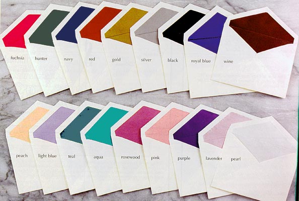
Here are some more basic coloured lined envelopes that look very professional even though basic. This is relieving because although here intended for wedding invitations, there is nothing to say that the idea can't be used to suit my cards. http://www.discount-invitations.com/indivpgs/lined.htm
These envelopes suit the standard white look which really makes that inside colour stand out. This is interesting because by doing it this way and not the way above with an unusual coloured envelope, i don't have to find a complementary colour to suit, so i can have what ever i thought worked well. I know that above i have said that i think an off white would really secure the warmth intended by the cards, but a white would give a nice contrast here with a colour lining the inside.
Having gone away and re-thought the envelope situation, i think that i will line the inside of the white envelope with a faint pattern of my Chimney logo as well as have it 'stamped' on the outside. On the outside i intend my 'stamped' chimney to be black as if printed with stamping ink and therefore resembling an authentic mail stamp. On the lining inside i hope to fade the chimney as not to be so intense.
No comments:
Post a Comment